Page layout and Design Strategy

Instructor: Chris Fulton
Learning Objectives
- Understanding Fixed, Fluid, Adapative and Responsive Layouts
- Box Modeling
- Padding | Margin | Border | Width | Height | Max-Width | Max-Height
- Box-shadow | Border-radius
- Display Property | Float Property
- Negative Margin | Active and Passive whitespace
- Traditional Float Layout
- Normal Flow
- Clear Property | Overflow Property
- CSS Flexbox
- CSS Grid
- Positioning
What type of layout will you choose?
- Fixed/Static layout – Size of the page and page elements are fixed, usually using pixels as the unit of measure
- Fluid/Flexible/liquid layout – The width of the page elements are set as a percent of the available screen width
- Adapative layout – Characterized by having defined layouts for different resolutions. Within each layout, resizing the window does not change the layout. You can think of Adaptive as a series of Static layouts.
- Responsive layout – Characterized by having defined layouts for different resolutions. Within each layout, the design is liquid and resizes the width of elements relative to the changing window size. You can think of Responsive as a series of Liquid layouts
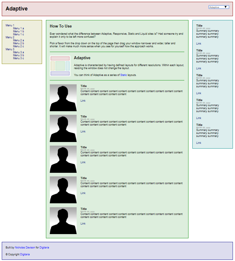
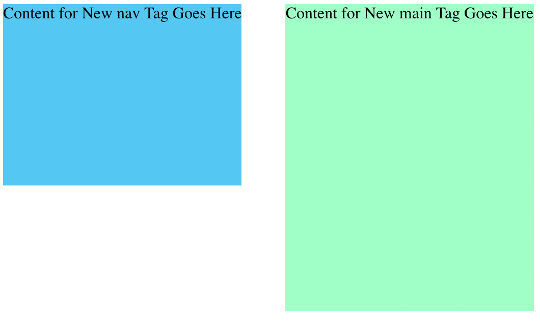
Click the picture for example of three layouts.
Fluid vs. Fixed Layout
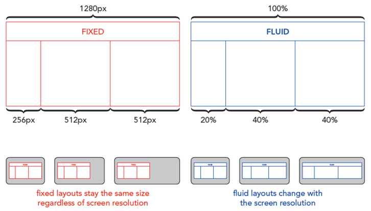
Fluid ✦ Fixed ✦ Adaptive ✦ Responsive
Box Modeling
Box Model and Properties
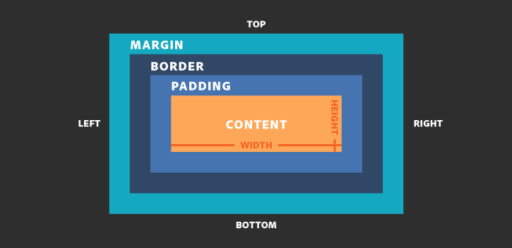
Box Model - Another View
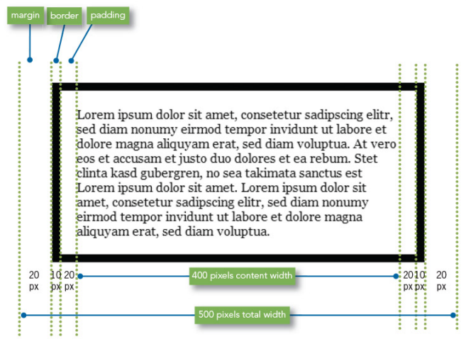
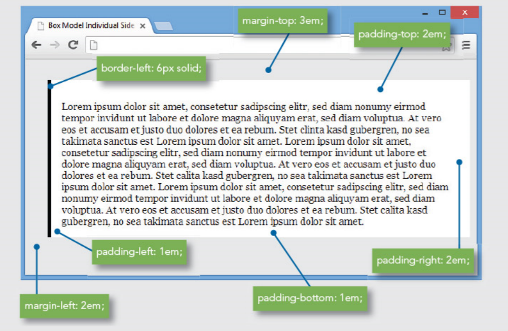
Box Model - Targeting Sides
Activity Part A
								<!DOCTYPE html>
								<html>
							        <head>

										<title>Basic Structure </title>
									</head>
									<body>
										<div> #1 </div>
										<div> #2 </div>
										<div> #3 </div>
									</body>
								</html>
Apply the following bullet points to the HTML code below.
- Create three boxes with a width and height of 250 x 250, apply a border radius of 14px for each box, apply a border that is 10px solid and color #333. Apply 12px of active white space around each box and float the boxes next to one another.
- Apply a background color of #BDD358, font-family of arial and a font-weight of bolder.
Activity Part B
								<!DOCTYPE html>
								<html>
							        <head>

										<title>Basic Structure </title>
									</head>
									<body>
										<div> #1 </div>
										<div> #2 </div>
										<div> #3 </div>
									</body>
								</html>
Apply the following bullet points to the HTML code below.
- Add a container to the webpage that is a width of 900px and center everything that displays in the browser.
- Change the content to the color white, center the text in each box and change the font size to 4em.
- Apply 14% padding to the top of each box elements.
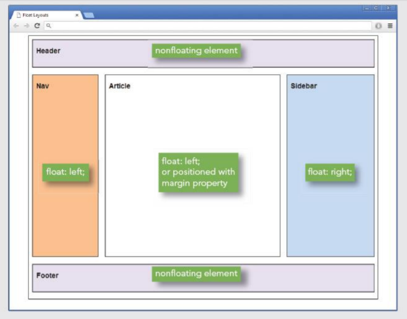
Traditional Float Layout
- Primarily Involves the float and clear property
- When you float an element, you take it out of the normal flow
- The float property lets you build columnar layouts
- You can align content elements to either the right or left
- A typical Web page design can contain both floating and non-floating elements
- Remember to always use a width property for floating elements
Using the Clear Property
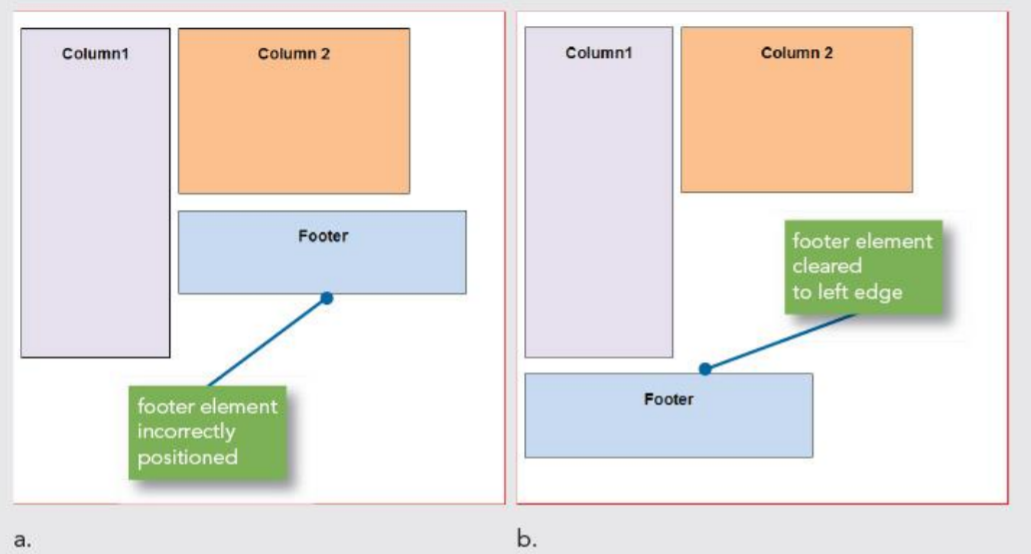
- The clear property specifies on which sides of an element floating elements are not allowed to float
- The most used values for the clear property are left, right and both
- Typically used for the footer section of your site.
Traditional Float layout Considerations
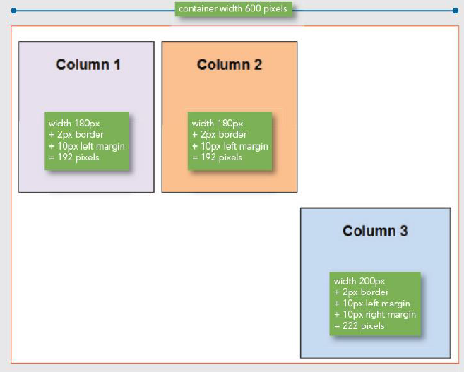
- If you are floating an element within another element, the order of the elements is important
- Column drops occur when the total width of the columnar elements in a page layout exceeds the width of their containing element
- Containers help to format and center box elements. Use margin auto to your advantage.
Quiz Question 1
The top = 10 pixels, The bottom = 5 pixels, The left = 20 pixels, The right = 1 pixel
How do you display padding for the box elements above?
Quiz Question 2
Which CSS property do you need to align 2 html elements side-by-side?
Quiz Question 3
When understanding Element Layers, which of the below items is correct?
Quiz Question 4
Which property provides active whitespace outside of the box element?
CSS Flexbox
Understanding Flexbox
aims at providing a more efficient way to lay out, align and distribute space among items in a container
flexbox layout is direction-agnostic as opposed to the regular layouts
flex container expands items to fill available free space, or shrinks them to prevent overflow
the main idea behind the flex layout is to give the container the ability to alter its items' width/height (and order) to best fill the available space
Flexbox layout is most appropriate to the components of an application, and small-scale layouts
In-Class Activity
								<!DOCTYPE html>
								<html>
							        <head>

										<title>CSS Flexbox </title>
									</head>
									<body>
										<aside> #1 </aside>
										<aside> #2 </aside>
										<aside> #3 </aside>
									</body>
								</html>
Apply the following bullet points to the HTML code below.
- Add a container to the webpage that has a width of 80% and center everything that displays in the browser.
- Apply a 3px solid orangedred border to the container and a 3px solid green border to the immediate children of the container.
- Create flex items of all the immediate children of the container. Each aside box element should have a flex-grow of 1, a flex-shrink of 0 and flex basis of auto and a height of 325px. Apply 10px of margin around each flex item.
- Justify the content for each box to space evenly.
Quiz Question 5
When implement CSS flexbox into your webpage, which option below is not necessary?
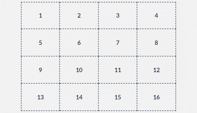
CSS Grid
CSS Grid Steps
Step 1
Define a container element as a grid with display: grid
Step 2
Set the column and row sizes with grid-template-columns and grid-template-rows
Step 3
Place child elements into the grid with grid-column and grid-row
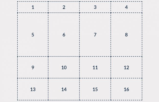
Defining the Grid
									.grid {
									 display: grid;
									 grid-template-columns: repeat(4, 1fr);
									 grid-template-rows: repeat(4, 75px);
									}
Defining a Complex Grid
									.grid {
									 display: grid;
									 grid-template-columns: repeat(4, 1fr);
									 grid-template-rows: 40px 2fr repeat(2, minmax(75px, 1fr));
									}
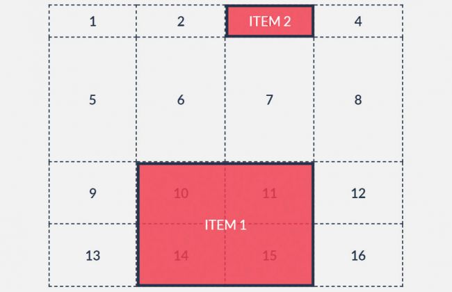
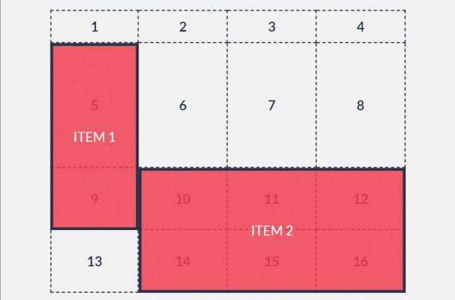
Positioning items in the Grid using line numbers
									.grid {
									 	display: grid;
									 	grid-template-columns: repeat(4, 1fr);
									 	grid-template-rows: 40px 2fr repeat(2, minmax(75px, 1fr));
									}

									#item1{
										grid-column-start: 2;
										grid-column-end: 4;
										grid-row-start: 3;
										grid-row-end: -1;
										background-color: red;
									}

									#item2{
										grid-column: 3;
										grid-row: 1;
										background-color: red;
									}
Positioning items in the Grid using area names
									.grid {
									 	display: grid;
									 	grid-template-columns: repeat(4, 1fr);
									 	grid-template-rows: 40px 2fr repeat(2, minmax(75px, 1fr));
									 	grid-template-areas: ". . . ."
                                                             "item1 . . ."
                                                             "item1 item2 item2 item2"
                                                             " . item2 item2 item2";
									}

									#item1{
										grid-area: item1;
										background-color: red;
									}

									#item2{
										grid-area: item2;
										background-color: red;
									}
Quiz Question 6
You are creating a grid layout. What does 1fr mean in the following code?
grid-template-columns: 150px 150px 1fr 1fr;Quiz Question 7
							.grid {
								 display: grid;
								 grid-template-columns: 200px 700px 75px 1fr 1fr;
								 grid-template-rows: 40px repeat(2, minmax(75px, 1fr));

							}
Using the code above, How many columns and rows are defined in the following code?
Quiz Question 8
Using the code above, which CSS property provides space between the grid items?
Quiz Question 9
Which of the following is not a way of placing items onto the grid?
Quiz Question 10
[True or False] Both CSS Flexbox and CSS Grid can be used in constructing the layout of a webpage
Quiz Question Extra Credit
What grid-template-areas value makes the Article span 2 columns?
Quiz Question Extra Credit
What does the CSS code grid-gap: 5px do?
Video Lectures
Composition and Layout Strategy
References
- http://www.liquidapsive.com/
- https://css-tricks.com/snippets/css/a-guide-to-flexbox/