Implementing Responsive Design
Instructor: Chris Fulton
Learning Objectives
- Recognizing the need for responsive design
- Responsive vs. Adaptive
- Mobile First Design
- Responsive Design Example and Process
- Elements of Responsive Design
- CSS Media Queries - Breakpoints and Media Types
- Implementing Media Queries
- Flexible Images
- Responsive Images
- <picture> tag
- Flexible Layouts
- CSS Flexbox
- Converting to relative measurement units
- Responsive Design Considerations
- Add/Removing Columns | Changing Navigation | Stacking Columns
- Making Site Responsive Ready
- Viewport Scale Meta Tag
- How far will Responsive Design go?
The Need for responsive design
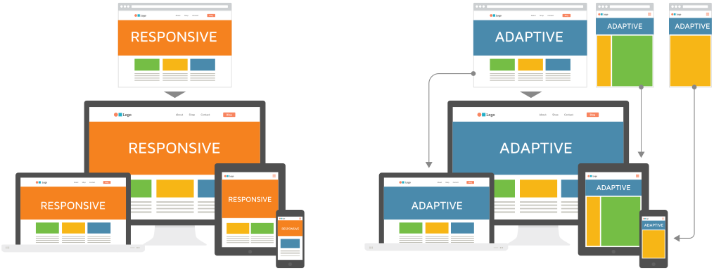
Adaptive vs. Responsive
Responsive Web Design (RWD) – Responsive Web Design is about using HTML and CSS to automatically resize, hide, shrink, or enlarge, a website, to make it look good on all devices (desktops, tablets, and phones)
Adaptive Design –Adaptive web design is different from responsive design in that there isn’t one layout that always changes. Instead, there are several distinct layouts for multiple screen sizes. And the layout used depends on the screen size used.
Mobile First Web Design
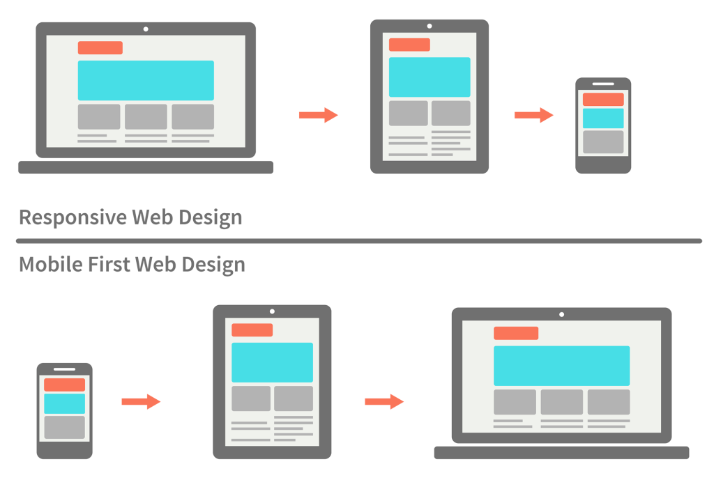
- Think carefully about your content and users’ needs when building responsive designs
- Which content is valuable to the user of a smaller device?
Responsive Design Example
The image above shows the responsive design of the World Wildlife Fund web site at five screen resolutions
Both page designs are flexible to adapt to sizes above or below the 768-pixel threshold. This threshold is called the breakpoint—the point at which design layouts change in responsive design schemes
Responsive Design Example
The image above shows the range of sizes and the breakpoint used in the style of the World Wildlife site. The web site design adapts to larger screen sizes, expanding and adding more content and navigation as the browser widths increase
In the example above, the breakpoint is set to 768 pixels
Responsive Design Process
Use CSS style rules to change the order, positioning, and other display characteristics of your page elements
Build one basic layout and then use style rules targeted to different screen sizes
Choose a breakpoint and then design for the devices above and below that point
Adapt your design for optimal viewing in each range of screen sizes
Content, not the device needs, should dictate when you choose breakpoints
How do you set a breakpoint?
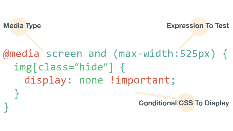
You need a Media Query
A media query is composed of an optional media type and zero or more expressions that check for the conditions of particular media features. Among the media features that can be used in media queries are ' width ', ' height ', and ' color '.
Media Queries consist of 3 parts
THE MEDIA TYPE
THE EXPRESSION(S)
CONDITIONAL CSS
Variety of Media Types
Media Query Breakdown
								@media screen and (max-width: 480px) {

                                 header {width: 90%;}

                                 }
With the addition of the following style rule, the browser will detect the maximum width of the screen. If it is 480 pixels or less, the header element will have a width of 90%
Media Query Breakdown
@media screen and (min-width: 480px) and (max-width: 768px}
You can add multiple media features with the and keyword
Implementing Media Queries
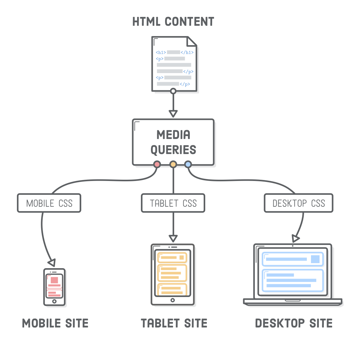
You have three options for applying media queries to specify style rules
In the following three examples, the styles are applied if the device screen has a maximum width of 480 pixels
- Linking to an External File – Using the link element or the @import css rule
- Implementing into exsisting CSS – Apply them within the style tags or withing external style sheet.
Apply Media Query using the Link tag
								<link rel="stylesheet" media="screen and
								(max-width: 480px)” href="mobiledevice.css">
The link element applies an external style sheet named mobiledevice.css if the device screen has a maximum width of 480 pixels
Apply Media Query using the @import css rule
								@import url("mobiledevice.css") screen and
								(max-width: 480px);
Using an @import rule to apply an external style sheet named mobiledevice.css if the device has a screen with a maximum width of 480 pixels:
Apply Media Query within style tag
							<style>
							@media screen and (max-width: 480px) {
								#headstruct{
									background-color: #cd0000;
								}
							}
							</style>
Using the @media rule within a <style> element
Multiple Style Rules for Three Breakpoints
							/* smaller than 1024 pixels */
							@media screen and (max-width: 1024px) {
								#headstruct{
									background-color: #cd0000;
								}
							}
							/* smaller than 768 pixels */
							@media screen and (max-width: 768px) {
								#headstruct{
									background-color: #eeff22;
								}
							}
							/* smaller than 480 pixels */
							@media screen and (max-width: 480px) {
								#headstruct{
									background-color: #ffee00;
								}
							}
Media Query Activity
Click on the button above and copy the source code into a new document and make the following changes below:
- Create two media queries 1) with a max-width breakpoint of 1024px and 2) another with a max-width breakpoint of 768px
- At breakpoint of 1024px
- Remove Box 2
- Remove border from each box and give each box the property of box-shadow: 2px 2px 10px #333;
- At break-point of 768px
- Change the height of all boxes to 375px
- Give box 1 a background-color of red, box 3 a background color of yellow, box 4 a background color of blue
Responsive Images
Working with Images
								img{
									max-width: 100%;
									height: auto;
									}
By specifying a percentage for your images, it allows the image to fill the space according to the percentage specified.
The CSS object-fit property is used to specify how an <img> or <video> should be resized to fit its container.
Link to W3 schools on object-fit
Working with the <picture> element
The <picture> tag gives web developers more flexibility in specifying image resources.
The most common use of the <picture> element will be for art direction in responsive designs. Instead of having one image that is scaled up or down based on the viewport width, multiple images can be designed to more nicely fill the browser viewport.
								<picture>
								  <source media="(min-width: 650px)" srcset="img_pink_flowers.jpg" >
								  <source media="(min-width: 465px)" srcset="img_white_flower.jpg" >
								  <img src="img_orange_flowers.jpg" alt="Flowers" style="width:auto;" >
								</picture>
The Viewport Meta tag
<meta name="viewport" content="width=device-width, initial-scale=1.0">
A meta viewport element gives the browser instructions on how to control the page's dimensions and scaling.
The width=device-width part sets the width of the page to follow the screen-width of the device (which will vary depending on the device).
The initial-scale=1.0 part sets the initial zoom level when the page is first loaded by the browser.
Microsoft Future 2020 Vision
Video Lectures
References
- mediumwell.com/responsive-adaptive-mobile/
- https://www.w3schools.com/html/html_responsive.asp
- litmus.com
